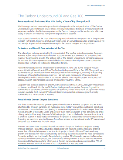
3D Model of Katahdin Hike
The Leaflet map on my homepage is one way to share the experience of hiking in Maine's Baxter State Park. I typically make a static map with route, mile makers, streams, AMC huts and elevation profile before heading to the hills for a hike. The 3D model is something I made after returning home from hiking Katahdin.
Click on the image at right to load the 3D model. The terrain is built from a USGS elevation raster; the hike is a GPX file from Strava; the basemap is built from the elevation raster, the National Hydrography Dataset, Baxter State Park Summer Trails KML, my models of buildings in along our route, and a hand drawn model of the tree line. There are slides to guide you at bottom left, but the model is interactive and can be navigated independently.
#3D #ArcGIS Pro #ArcGIS Online #gpx
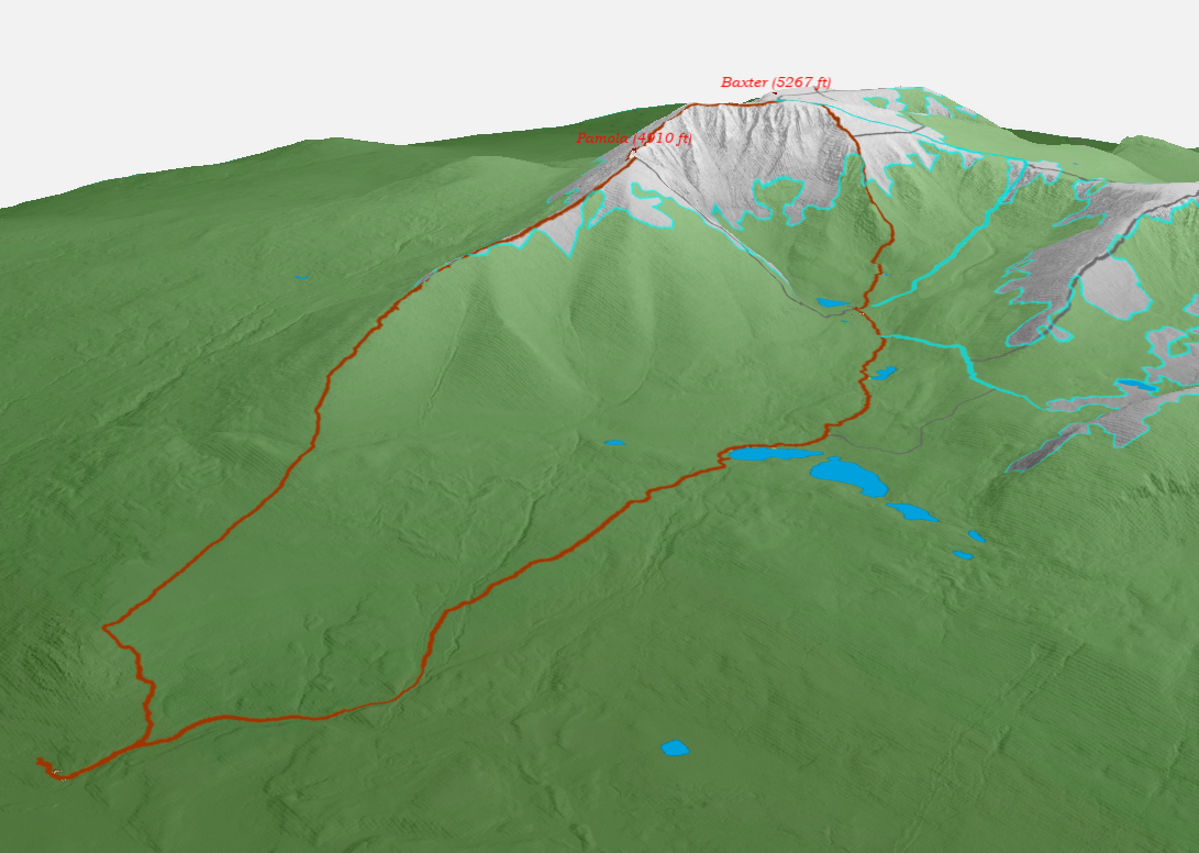
3D Scene using LiDAR
To understand my neighborhood in suburban Massachusetts, I downloaded USGS LiDAR data from 2021 and visualized the buildings and topography as 3D objects. Compared to high resolution satellite imagery, LiDAR data reveals details completely obscured by vegetation and the tree canopy.
The map at right shows buildings in orange and topography in gray. Each element is built using USGS LiDAR data processed in ArcGIS Pro and ArcGIS Online. I added parcel boundaries from MassGIS for context. Click on the map to navigate the scene in 3D.
#LiDAR #3D #ArcGIS Pro #ArcGIS Online
R and US Census Data
R is well established for data science for good reason: data handling is better than Excel or GIS packages, and the code clearly documents data access and processing. R is great for spatial analyses too. With R libraries, US Census data is downloaded with geometries and visualized with basemaps.
The map at right was created using Open Source software and US Census data published by the Department of Commerce. More specifically, RStudio and the R libraries tidycensus, tigris, sf, and tmap.
#R #tidycensus #demographics
Highlight Vegetation using R
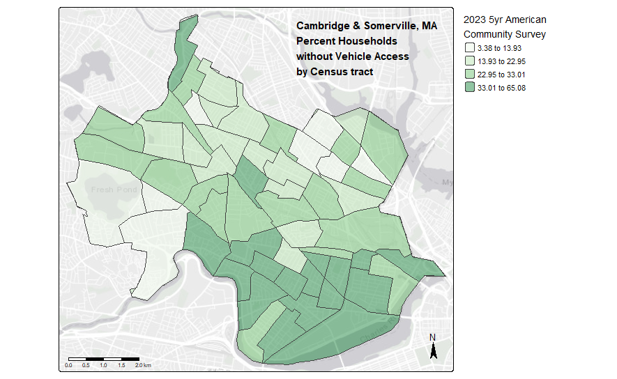
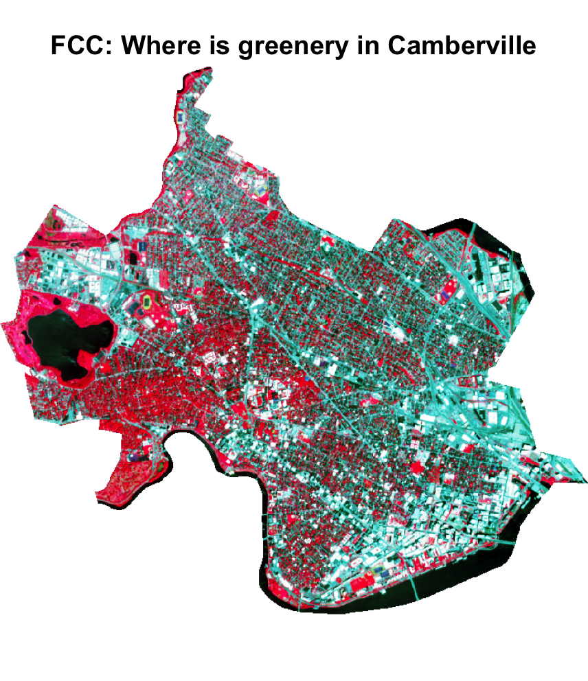
Most people are familiar with satellite data from using Google maps. Those maps utilize data from visible-spectrum sensors, but many satellites capture a much wider range of data. The False Color Composite (FCC) at right uses data that the human eye can’t see to highlight healthy vegetation in Cambridge and Somerville, MA.
Here, I’ve dropped the blue band and reassigned colors to the red, green, and near-infrared bands. The result visualizes healthy vegetation in bright red; water is black; paved areas in shades of green. The maps highlights the ample canopy cover in West Cambridge, the Tip O’Neill Golf Course and Alewife Brook Reservation in red, and Fresh Pond in black.
The image uses Sentinel-2 data from May 2025. The terra package in R makes it easy to manipulate Sentinel-2’s 13 bands or create normalized difference indices. A normalized difference index can be reclassed to measure acres of wooded land.
#R #raster #terra #Sentinel-2
Vision Zero Crash Map
The Massachusetts Vision Zero Coalition tracks traffic fatalities for vulnerable roadway users as part of their advocacy for safer roadways. When the data outgrew their current visualization, our team of students developed this Leaflet based webmap with improved aesthetics and functionality. Click on the image at right for details in a StoryMap format.
#Leaflet #HTML #JavaScript #CSS

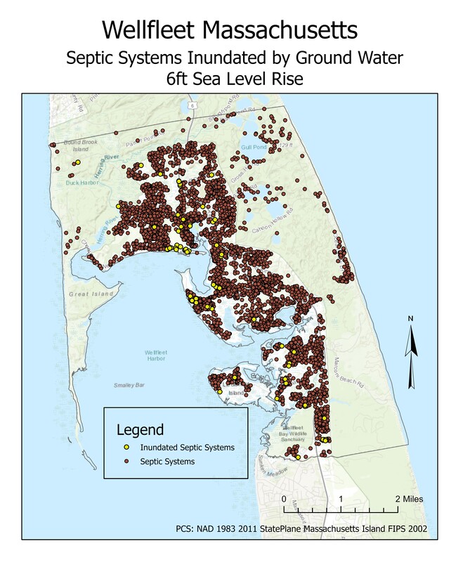
Sea Level Rise and Ground Water Table
On Cape Cod, fresh ground water 'floats' on an underlying bed of sea water. As sea levels rise, so does the ground water that many coastal communities depend on for well water. We modeled ground water levels based on a 2015 survey of wells and septic systems in Wellfleet, MA. Among our findings: six feet of sea level rise will cause septic systems in 78 homes will to cease operating properly due to ground water incursion. Separately, 65 wells will be inundated by sea water. A 2017 NOAA report estimates a 15% probability that sea level rise on Cape Cod will exceed four feet by 2050 and less than 1% probability that it will exceed ten feet by 2100. Our analysis is based on a six foot sea level rise.
#ClimateChange #ArcGISPro
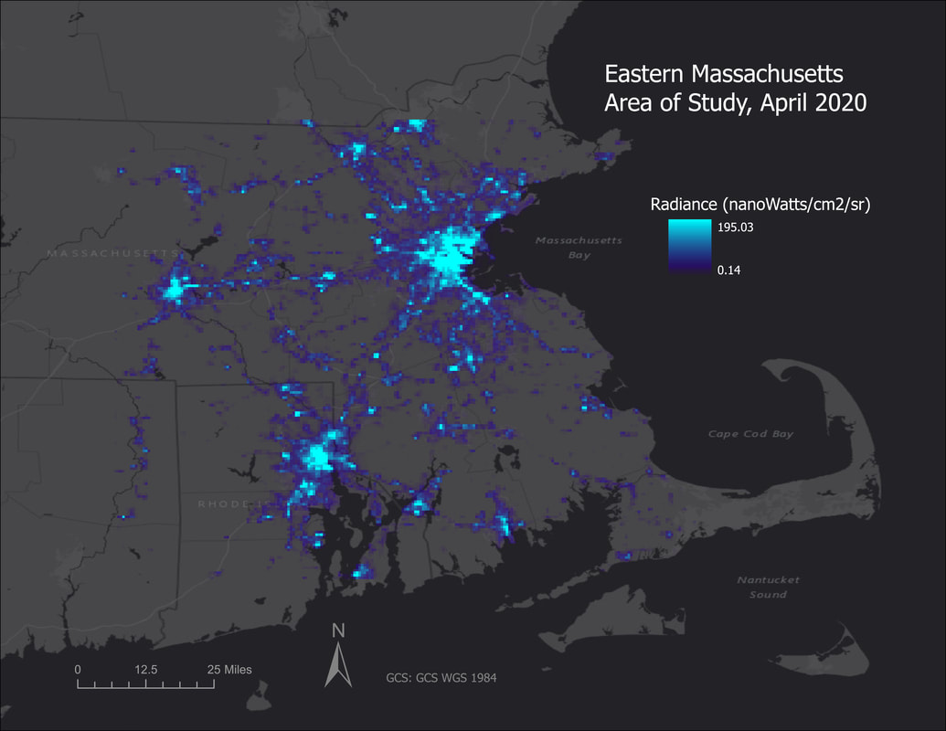
COVID-19 and Night Lights
Was COVID-19 visible from space? Using Google Earth Engine Code to analyze night time luminosity captured by satellite, the impact of COVID-19 restrictions for Massachusetts and Florida are contrasted. The surprise finding was that land use had more influence on changes than state mandated restrictions. Click on the image at right for details in a StoryMap format.
#GoogleEarthEngineCode #ArcGISPro #COVID19
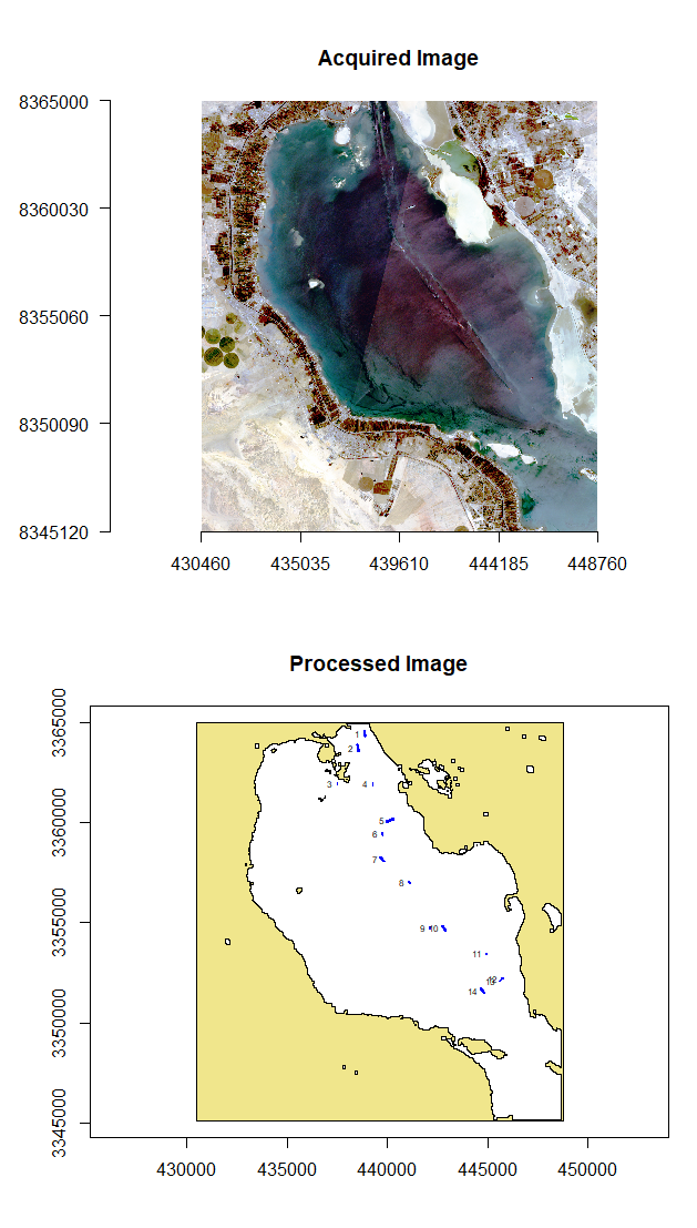
Identifying Ships at Sea Using R
cargocounts is an R package which uses freely available satellite imagery to identify latitude and longitude coordinates of ships at sea. Sentinel-2 data is uploaded as a tif file and processed as a raster image to produce a vector image of ship locations and coordinates with 95% accuracy. Click on the image at right for details in a StoryMap format.
#RStudio #GitHub #MachineLearning
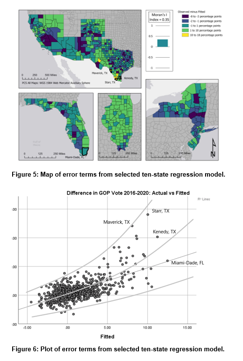
GOP Gains Among Latino Voters in 2020
In the 2020 Presidential election, counties with large Latino populations demonstrated consequential increases in support for the GOP. These gains undermined the increased support Democrats had won among moderate and suburban voters, contributed to GOP wins in key battleground states, including Texas and Florida, and resulted in a closer election than Democrats had hoped.
We analyzed 50 independent variables across age, race and ethnicity, education, income, employment, healthcare access, and access to technology at the state and county level for the ten states with the largest Latino populations. Our findings indicate that demographic variables are associated with the vote change in the West and Southwest states, and socioeconomic variables are associated with the vote change in the Eastern states. The difference highlights the heterogeneity of the vote in important Latino states, and makes clear that political parties cannot use a single strategy for Latino outreach.
#SPSS #ArcGISPro #AmericanCommunitySurvey
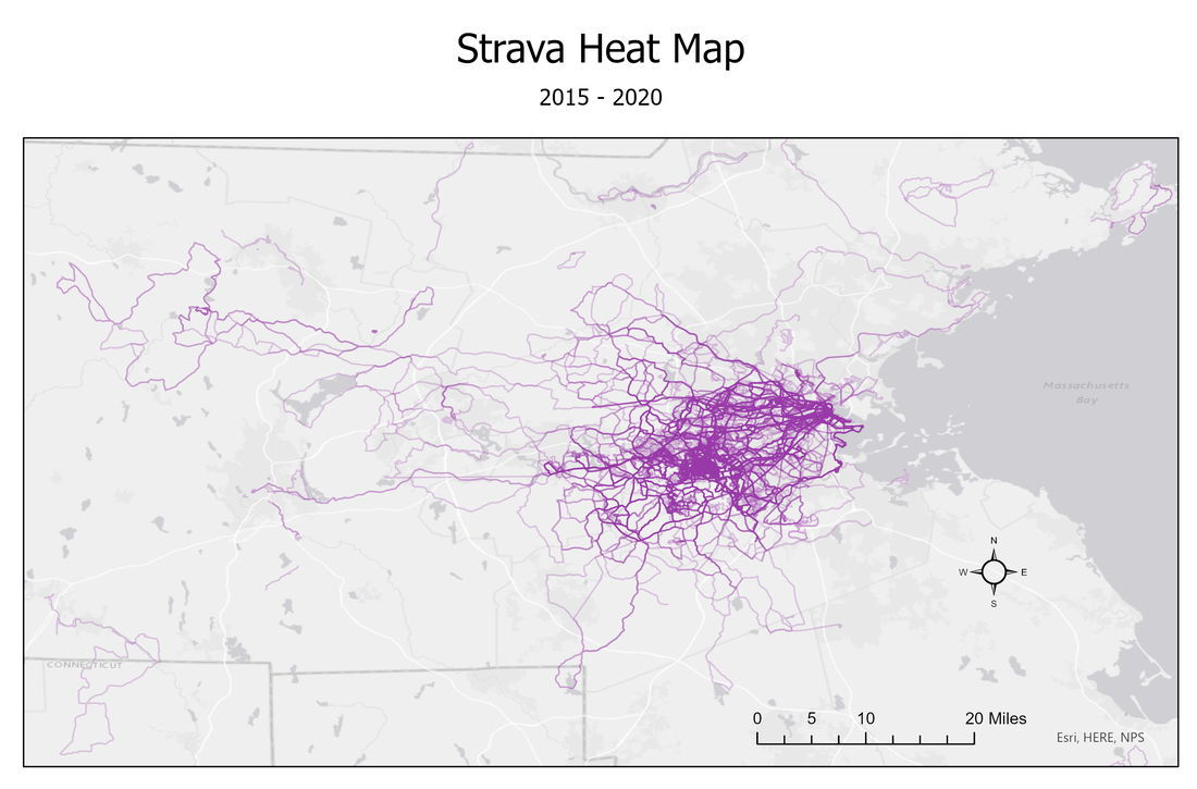
Strava Heat Map
This style of heat map overlays five years of bicycle rides to show which routes are most heavily used. GPS trackers record a way point about every second. To visualize this data, roughly 15 million waypoints were processed into 2,600 polylines. Select attributes for each ride were uploaded and associated with the ride coordinates to create a flexible illustration of how riding habits changed over the period. All the processing was completed using ArcPy module in ArcGIS Pro.
#ArcGISPro #ArcPy #GPS
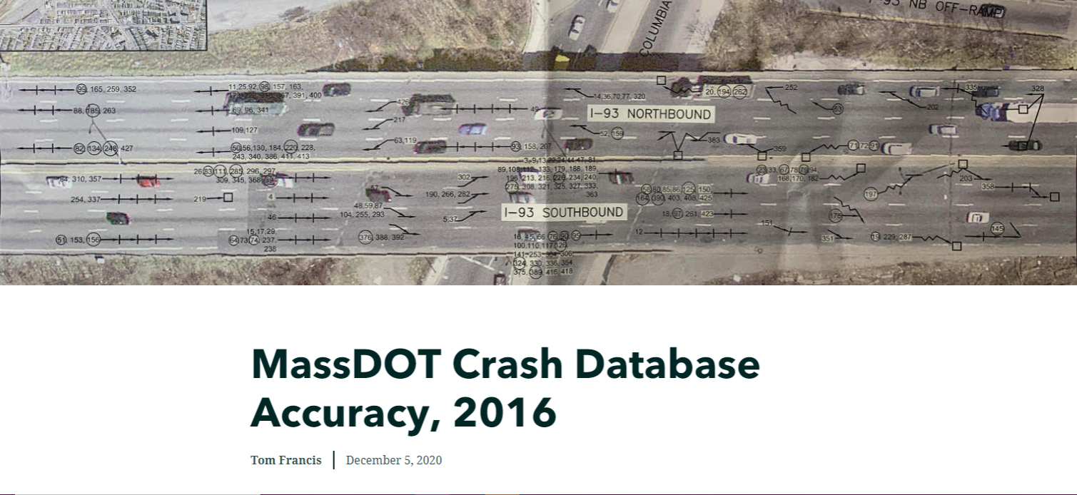
MassDOT Crash Database Accuracy
MassDOT's Crash 2016 data set includes over 143,000 roadway crashes. The data is anonymized, which is appropriate, but which also makes accuracy assessment difficult. An independently compiled set of roadway fatalities is used to measure error rates in the Crash dataset. Click on the image at right for details in a StoryMap format.
#ArcMap #Vector #MassGIS
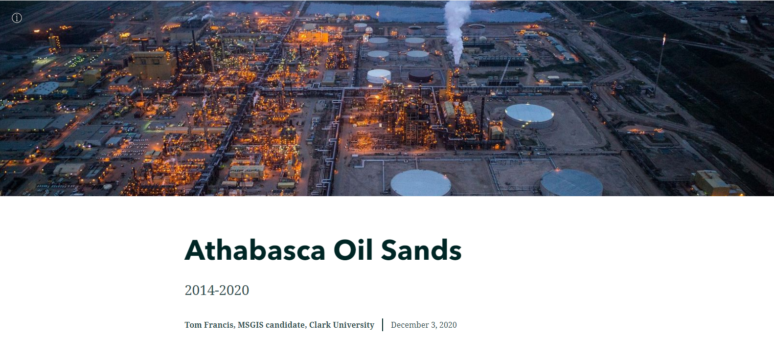
Canadian Oil Sands 2014-2020
Oil Sands mines tend to be owned and operated by large conglomerates. As part of a much larger organization, production volumes and operational details fall below the threshold for regulatory filings. In this analysis, I use satellite imagery to measure changes in mine footprints since the price of oil collapsed in 2014. Click on the image at right for details in a StoryMap format.
#TerrSet #Raster #StrandedAssets
Tracking Oil & Gas Reserves
The Carbon Underground is an annual report detailing the potential carbon emissions associated with existing oil, gas and coal reserves. Reserves are the fossil fuel industry's inventory: hydrocarbon deposits that companies own but have not yet been extracted. I provided the commentary and underlying research for several editions of the Carbon Underground's Oil and Gas sections.
The Carbon Underground is produced by Fossil Free Indexes. While working with Fossil Free Indexes, I maintained the Oil & Gas 100 and developed the Tar Sands 20: lists of publicly traded companies holding the largest fossil fuel reserves. The lists were updated on quarterly and provided a basis for fossil fuel divested investment products.
#Financials #ClimateChange #StrandedAssets